Landing pages are a subtle but powerful way to gently nudge people into our marketing funnel. Someone visits our website, and we can use our landing page to present them with something they might find attractive (a discount code, a how-to booklet, a free item) and we have increased the chances that this person will become a paying customer.
If only it was that easy!
The time we have to catch the attention of people scrolling on your landing page is short. As in under 5 seconds. Landing pages traditionally mimic the layout of a standard webpage, but to stay true to the 5 second rule we need to make sure we limit the information and number of choices available.
How do we design a landing page that catches the visitor’s interest and achieves a higher conversion rate?
When it comes to designing a landing page, the layout plays a crucial role in capturing and retaining attention. A well-designed layout can enhance the user experience and improve the chances of conversion. Here are some key considerations for creating an effective landing page layout:
Headline and sub-headline text
If we can’t describe what the landing page offers (and why it is of benefit to the visitor) in a short, punchy headline the message is likely to be lost amongst the words.
We should point out in the headline what makes this offer different and more attractive from other similar offers they will have seen before and use the sub-headline to support the main focus of the headline.
Use images wisely
Too many images can make the page appear cluttered, and a cluttered page confuses people. Make sure the main image reflects the benefits to the customer. This isn’t necessarily our product!
Hierachy of information
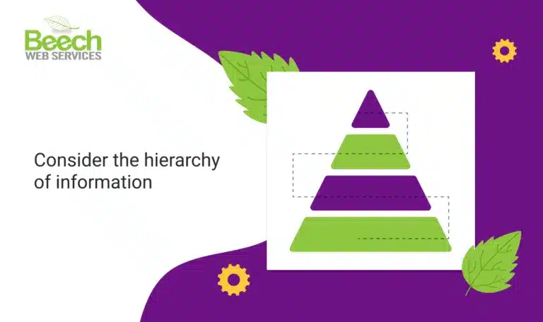
Strategically place elements such as the call to action on the page to catch visitors’ attention. The top third of the page, also known as above the fold, is key for catching visitors’ attention, so make sure to position the call to action prominently in this space and ensure it stands out visually.
Use contrasting colours, bold typography, or directional cues to draw attention to the CTA. The call to action should use words that invite the visitor to take action – such as ‘Download our brochure’, ‘Request a quote’ or ‘Book an appointment’ – not simply to ‘Click here’.
Minimise form fields
Ideally limit this to just two fields: first name and email address. Simplifying the process and if possible, requesting only the email address can make the offer more appealing and less laborious. If taking action is quick and simple, people are more likely to do it.
Add social proof
Place these strategically on the landing page to reassure visitors that our offer is reliable and has satisfied previous customers. Make sure that the review message also reinforces why the product or service has been beneficial to others.
Optimise for mobile devices
Use analytics to understand what devices are used by our audience so we can create a landing page that best fits our audience.
Responsive design ensures the page adapts seamlessly to different screen sizes, providing a consistent user experience across desktop, tablet, and mobiles. Test the landing page on various devices to ensure readability, functionality, and ease of use. Text on a landing page, for viewing on a desktop, will look very different on a mobile device and we can often lose important information if the design is not mobile responsive.
Consider post-conversion experience
Once a visitor completes the desired action, whether it’s submitting a form or making a purchase, it’s essential to have a well-designed thank you page. This page should confirm the successful completion of the action, provide relevant information or next steps, and encourage further engagement or sharing. Consider integrating social media sharing buttons or additional offers to capitalise on the momentum of the conversion.
To summarise
Let’s be clear about what we want from a landing page.
Remember, a well-designed landing page layout needs to align with the overall goals of our campaign and encourage visitors to take action. By implementing a clean and visually appealing design, optimising for mobile devices, and strategically placing elements, we can create a compelling landing page that effectively converts website visitors into paying customers.
We hope you found this useful and remember, the key is brevity and clarity!
If you need support to improve your landing page, get in touch with our team on 01925 387040 – or request a free health check for us to review your website.
